Web Strategy for SaaS Startups
What is a web strategy for SaaS?
A web strategy is a structured approach to building and evolving your website so it supports growth, acquisition, and retention. It combines design, content, SEO, analytics, and conversion strategy to help SaaS startups reach product-market fit faster and scale beyond it.
Why SaaS startups need a web strategy
For Seed, Series A, bootstrapped, and AI Agent startups, your website is often the first (and sometimes only) salesperson. Without a clear strategy, it becomes a brochure — not a growth engine. A strong web strategy helps:
- Convert traffic into signups, trials, or demos
- Reduce CAC by increasing on-site efficiency
- Educate users and investors
- Clarify product value fast
The website’s role in SaaS go-to-market
Your site is central to every GTM motion:
- PLG: Homepages, onboarding flows, self-serve pricing
- SLG: Demo pages, case studies, trust signals
- Hybrid: Split flows for different types of buyers
- AAAS: Clear explanation of agent capabilities, demos, and integrations Every successful GTM starts with a site that’s designed to support it.
Signs you need a web strategy
- Homepage bounce rate is over 70%
- You get traffic, but few signups
- Your team doesn’t know what to change or test
- Your messaging is inconsistent across pages
- You’re launching new features, but the site isn’t keeping up If any of these are true — you’re not just missing conversions, you’re missing growth.
Components of a winning SaaS web strategy
- Clear positioning and messaging
- ICP-specific page structure and navigation
- High-performing CTAs and offers
- SEO-focused content architecture
- CRO testing and iteration plan
- Scalable CMS and design system
Positioning and messaging hierarchy
Your website should communicate what you do in 5 seconds or less. Structure messaging in layers:
- Core value (above the fold)
- Key benefits (scroll or tabs)
- Proof points (logos, testimonials, case studies)
- Feature deep dives (later sections) This clarity matters 10x more for AI Agent startups where value is often abstract.
Homepage design strategy
The homepage has one job: get the right people to the next step. Focus on:
- Headline clarity (“What is it and who is it for?”)
- Offer visibility (“Start free,” “Book a demo”)
- Visuals that show the product, not just decorate
- Above-the-fold CTA
- Proof near scroll points Design for decision speed — not just aesthetics.
Landing pages that convert
Great landing pages are focused, fast, and frictionless. Each page should:
- Match user intent (from ad, email, or search)
- Reinforce a single offer or value prop
- Use specific, benefit-led headlines
- Avoid clutter — guide the user to one action AI-powered platforms especially benefit from showing agents in action.
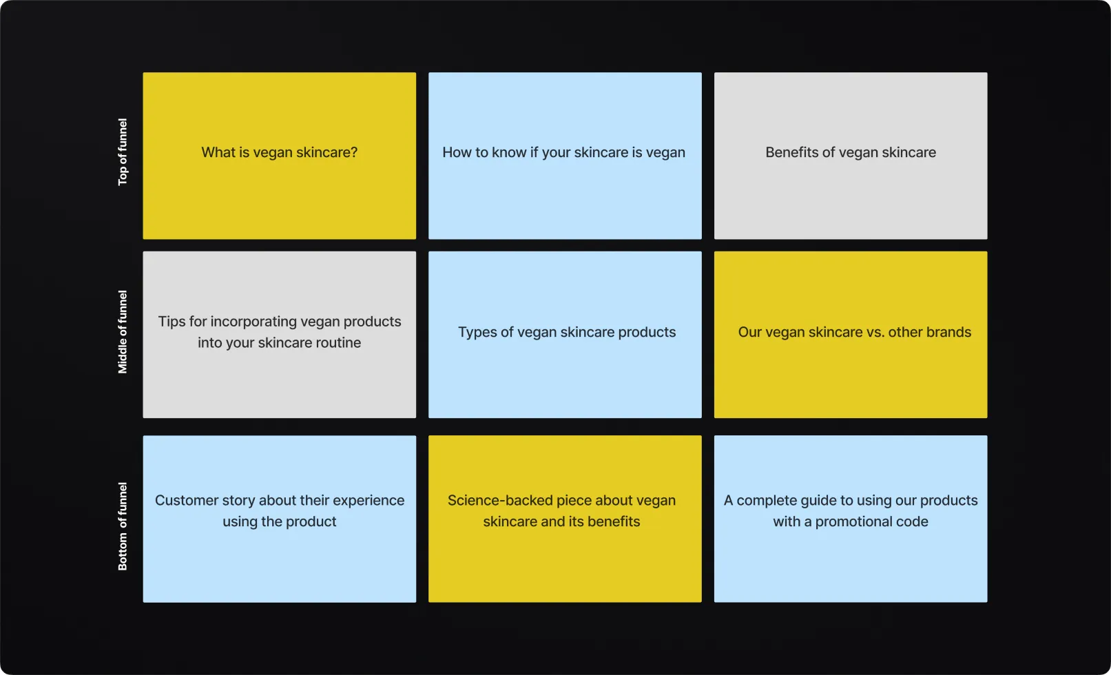
Website structure by user journey stage
Top of funnel (TOFU)
Focus on:
- SEO blog content
- Product overviews
- Industry-specific use cases
- Comparison pages (vs. competitors or manual workflows) These attract attention and awareness.
Middle of funnel (MOFU)
Now the user is problem-aware. Guide them with:
- Customer stories
- Feature walkthroughs
- Video demos
- Interactive tours or sandbox experiences Help them evaluate — not just explore.
Bottom of funnel (BOFU)
These visitors are ready to act. Use:
- Demo request pages
- Pricing with clear breakdowns
- Integration info
- Security and compliance pages BOFU traffic converts when you reduce doubts and increase urgency.
Building a high-converting pricing page
Best practices for SaaS pricing pages
- Anchor pricing with feature clarity
- Add “most popular” tier badges
- Include FAQs that reduce objections
- Use toggles for monthly/annual view
- Add social proof near plans
AI Agent pricing strategy tips
- Show what’s included in each agent plan
- Visualize usage-based pricing (actions, users, integrations)
- Make ROI instantly clear ("Save 20+ hours/week")
- Offer interactive calculators when possible
Product pages with impact
Product pages aren’t about listing features — they’re about showing value. Structure them with:
- Short headline + benefit
- Use case visuals
- Feature clusters by job-to-be-done
- Light comparison or replacement angle (“Better than Zendesk macros”)
- CTA near every scroll break
Design system for consistency and speed
A scalable SaaS web strategy includes:
- UI components for every use case (CTAs, testimonials, forms)
- Color and typography guidelines
- Icon and illustration library
- Spacing and layout grid With Webflow, Framer, or Next.js — you can make it fast and flexible.
Webflow as a strategic tool
Webflow empowers marketing teams to iterate quickly:
- No dev bottlenecks
- Visual consistency
- CMS for scaling content
- Easy A/B testing and launches Perfect for bootstrapped SaaS and early-stage teams.
SEO-driven web strategy
Why SaaS websites need SEO strategy
Search is still one of the best ways to capture intent. Your web strategy should include:
- Keyword-based content clusters
- Technical SEO best practices
- Fast, mobile-optimized performance
- Internal linking and hierarchy
Page types to include
- Blog: How-to guides, problem/solution posts
- Glossary: Define industry terms and rank long-tail
- Comparison: vs. competitors or legacy workflows
- Feature pages: Targeted to specific use cases
- Success stories: Optimized with schema markup
AI-specific SEO content
For AAAS products, focus on:
- Use case queries ("AI for onboarding emails")
- Tool queries ("ChatGPT alternative for SaaS")
- Integration content ("Use GPT in Slack")
- Outcome content ("reduce response time with AI") Make the invisible tangible through smart copy and examples.
Analytics and performance tracking
What to measure
- Page-level bounce and exit rates
- Trial or demo conversions by page
- Scroll depth and CTA clicks
- Source/medium performance
- Funnel drop-off points
Tools to use
- GA4 + Looker Studio for dashboards
- Hotjar or Fullstory for behavior insights
- HubSpot, Segment, or Amplitude for journey mapping
- Splitbee or PostHog for lightweight setups
CRO and A/B testing strategy
What to test
- Headlines and subheads (clarity vs. curiosity)
- CTA button language and color
- Hero section layout and visuals
- Pricing page formats (grid vs. accordion)
- Signup flow steps
Where to start
Start with highest-traffic pages:
- Homepage
- Top 3 landing pages
- Pricing
- Onboarding/signup Big lifts come from small headline shifts.
Conversion copywriting principles
Use user language
Pull phrases from reviews, calls, and interviews. Match how real users describe the problem.
Make the benefit immediate
Replace “We help teams collaborate” with “Cut status meetings in half.”
Every section = one job
One idea per section. One CTA per scroll. Guide attention.
Web strategy for conversion rate optimization (CRO)
Key CRO levers on SaaS sites
Your site should constantly evolve based on user data. Focus on:
- Headline testing (clarity vs. cleverness)
- CTA button placement and copy
- Simplified forms (fewer fields = more leads)
- Live chat or chatbot CTA options
- A/B testing of hero images and layouts
Optimizing for trial and demo conversions
Segment CTAs by:
- User type (founder vs. team)
- Intent level (learn vs. buy now)
- Traffic source (SEO vs. paid) Use dynamic CTAs or smart blocks for personalization.
CRO for AI Agent platforms
Test:
- Different ways to describe the agent (“your AI teammate” vs. “autonomous assistant”)
- Before/after copy blocks
- Signup flows: try now vs. book onboarding
- On-page explainers or animations
A/B testing and experimentation culture
Start simple
Run 1 test per funnel stage:
- Homepage: headline or CTA variant
- Product page: layout order
- Pricing page: testimonial vs. FAQ layout
Track real metrics
Avoid vanity metrics. Measure:
- Conversion to trial or demo
- Scroll depth and bounce
- Post-signup activation
Use test insights across the stack
- Feed winning messaging into ads
- Update onboarding with top-converting phrasing
- Use heatmaps to refine page layouts
Maintenance and scalability
Keep the site fresh
- Update content monthly (even small tweaks)
- Replace screenshots as product evolves
- Add new use cases, logos, or metrics
Modular design system
Build in Webflow, Figma, or a design system that scales:
- Reusable sections (testimonials, features, CTAs)
- Design tokens for colors, fonts, spacing
- Documented components to ship faster
Team ownership
Assign clear roles:
- Marketing owns content and CTAs
- Design owns visuals and structure
- Growth owns analytics and testing Use a shared project board or CMS for coordination.
Final thoughts on web strategy for SaaS
Your website is never done
Great SaaS websites evolve weekly. Treat your site as a living product:
- Ship updates frequently
- Build feedback into your analytics
- Treat content as part of growth — not just SEO
Don’t separate product and website
Align language, visuals, and flows across your site and product. From homepage CTA to in-app copy — it should feel like one experience. Especially for AI startups, seamless brand-product connection builds trust.
Build for users, not internal teams
Avoid building for stakeholders. Build for:
- New visitors who know nothing about you
- Prospects comparing 3–5 tools
- Customers who want help or answers fast
Website strategy = GTM strategy
Your site should reflect your actual motion:
- PLG? Self-serve flows, product tours, and quick-starts.
- SLG? Deep ROI pages, demo CTAs, and sales-assist resources.
- Hybrid? Smart routing, segmented CTAs, and parallel pages. Match site structure to funnel friction.
When to bring in help
You might need help if:
- Your homepage bounce rate is >60%
- Your messaging feels generic or unclear
- You can’t run tests or make changes quickly
- Your site doesn’t support new offers or launches A strong partner can help clarify, rebuild, or re-structure fast.
Final checklist
- Clear homepage headline and CTA
- Consistent messaging across pages
- Fast load speed on mobile
- SEO-ready structure and pages
- CRO tracking and experimentation enabled
- CMS flexibility for fast updates
- Visual identity aligned with brand
- Proof and social validation included


.webp)


.svg)


%201.svg)